HOW EFFECTIVE IS THE COMBINATION OF YOUR MAIN PRODUCT AND ANCILLARY TEXTS?
When creating a media product supported by ancillary texts branding is vital. Consistent themes need to be created throughout all the products to make it identifiable, especially in the current film industry where films come out almost daily products need to have effective branding to differentiate them. This can be done in a variety of ways through an iconic image, font, colour, character or even logo. To make the branding effective the features used must be clear and distinguishable to make your image iconic, the more iconic your branding the more popular your product will be and the more views you will attract.
Iconic Overall Branding
|
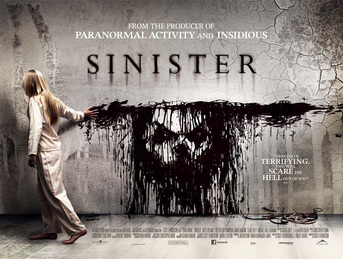
* Font
* Use of children * Common use of antagonists face * Created a brand so effective it continued into a sequal |
|
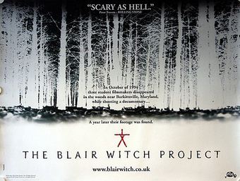
* Font
*Colour scheme * Symbol * Tag line * Web address |
How I Branded My Products
|
|
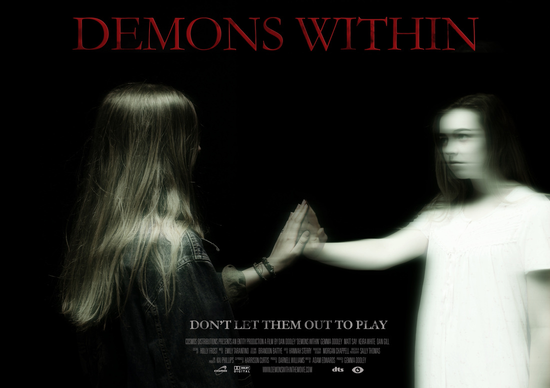
Imagery in My Products - I chose to use the main protagonist from the trailer as the face of my poster and magazine cover. Repetition reminds the audience of the trailer and create links between the main product and my ancillary products. I decided to use the protagonist because she is the main feature of the adjoining story line in my trailer and the soul that possesses the main character from the 'present day'. I also believed that it gave me the chance to create an iconic and memorable image, the key protagonist has a strong look which catches the audiences attention which helps enforce my brand as it is repeated throughout all the products.
Colour Scheme in My Products - For my branding I included a consistent colour scheme matting horror conventions of black, white, red and grey. I used this because as I have found from my research of branding this colour scheme works really well for so many iconic horror films. The contrast of these colours make the writing clear & easy to read which is key on posters and magazines as if they're too hard to read the consumer wont be appealed to it. Keeping the key colours consistent throughout the range of products means they help to build my brand. In the trailer all my titles are on a black background with white or red writing and in the final film title and the institutional information title the writing is all in red as they're vital pieces of information. I then supported this in my ancillary products by using the same classic red for my film title on both my magazine cover & poster. I also used a dark grey for my tag line 'don't let them out to play' on both products and the other key institutional information on my poster in white to keep with themes from my trailer.
Font in My Products - I used a consistent font throughout my product to reinforce branding as fonts are key features related to products especially in iconic films they can be recognised by it alone. I chose this font because I believe it works well as a classic horror font. Many are clean cut with horror effects added to them such as I did with my font. I also think the gothic look of the font works well as the whole idea of my trailer is past coming into the present.
