WHAT HAVE YOU LEARNT FROM YOUR AUDIENCE FEEDBACK?
Audience Trailer Reaction
Questionnaire
To gather audience feedback about my media products I found 4 candidates of a range of ages and genders to complete a questionnaire about what they thought of it.
Candidate 1: Emily, Age 18
Candidate 2: Jake, Age 19
Candidate 3: Sally, Age 41
Candidate 4: Ryan, Age 35
Q1) Did you enjoy our trailer? What would you rate it out of 10?
C1: Yes, I would give it an 8/10.
C2: I would give it a solid 6/10, the trailer was decent however some of the acting was kind of unrealistic.
C3: I would rate it a 7/10, it was okay.
C4:Yes I did, I would give it a 7/10
Q2) Would you go to the cinema to watch the film? Why?
C1: Yes I would, It looks like and interesting concept with some scary features. I also liked the fact that it seemed quite realistic through the use of handheld shots and not over played like some paranormal horror films.
C2: I probably would, because it's a decent concept.
C3: Yeah, because it looks scary.
C4: Probably, I don't really like horror however the storyline looks interesting.
Q3) What do you like/dislike about the magazine cover?
C1: I like how scary looking it is, however I would have emphasised the expression on the girls face to catch my attention more.
C2: I don't understand the significance of the posts (the cross in the background) which draws more of my attention away from the writing.
C3: I like the picture however, it could have had an effect over it to make it more inline with the other products because compared to them its just a little bit to clean cut.
C4: I love the composition of poster, however I would've probably darkened it slightly to match the poster as i think the poster is more closely related to the trailer.
Q4) What did you like/dislike about the poster?
C1: There was nothing I disliked about the poster, I thought it was really eye catching and scary. The use of the contrasting picture against the dark background works really well and I thought it was a really good way of representing the idea of the film of the soul possessing the main character.
C2: Overall I like the poster its quite freaky, the editing is really effective and I love the way the character on the right was distorted because it makes the character look intimidating.
C3: I like the poster, it looks cool! I like how it shows the girl from past and present and it looks very professional.
C4: I again really like the composition of it, it definitely screams horror. I also love how one side is clear and sharp and the other is distorted and blurry.
Q5) Do you think collectively my products made a successful brand?
C1: Yes I could see clear links between the main product and supporting ancillary products such as the common theme of character, fonts and colour scheme.
C2: Its pretty cohesive, however the girl on the right wasn't in the trailer enough you only saw her briefly in some of the photos also i think the Ouija board was a key prop and could have effectively be used throughout the branding.
C3: I think theres clear links between the magazine and the poster however you should have shown more shots of the girl in the trailer if you were going to use her as the main focus of the ancillary products.
C4: Yes, the writing and colour scheme was all consistent however i think it could've been slightly more effective if you had darkened the magazine.
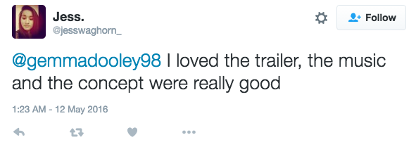
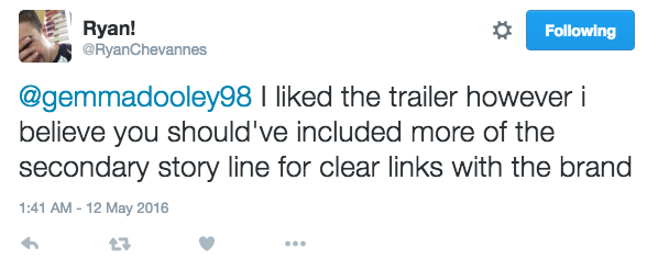
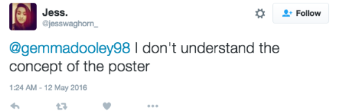
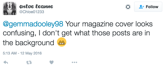
Social Media Response
|
|
What I Learned
There were many things my audience research highlighted that I had done well, for example all 4 of my candidates said they enjoyed the composition of my trailer and said they would go and see it at the cinema even the candidate who said they don't particularly like horror. Also from the audience reaction video the candidate spoke of how he enjoyed the shots transitions and editing of my video and the composition of the death scene at the end he clearly reacted strongly to it. A large percentage of my audience also spoke of how the loved the poster and the magazine cover and thought they worked well together. The social media reviews also spoke of how they liked the trailer.
However my feedback also brought up some key issues I could improve on.The first being the lack of my key antagonist in my trailer it was mentioned in my questionnaire by candidates 2&3 they liked the use of her in my magazine cover and poster however did not see the clear link with her in the photos from my trailer because she only appeared briefly. Another key issue brought up by candidate 2 and in one of the social media reviews of my magazine cover was that the cross wasn't clear as a prop and was confused for wooden posts. It was also mentioned that I should have used the ouija board as a consistent poop in my ancillary texts, I think this would've be a great idea as its a key feature from my trailer really focused upon in many shots and it may have helped my audience make clearer links between them and my main product.
However my feedback also brought up some key issues I could improve on.The first being the lack of my key antagonist in my trailer it was mentioned in my questionnaire by candidates 2&3 they liked the use of her in my magazine cover and poster however did not see the clear link with her in the photos from my trailer because she only appeared briefly. Another key issue brought up by candidate 2 and in one of the social media reviews of my magazine cover was that the cross wasn't clear as a prop and was confused for wooden posts. It was also mentioned that I should have used the ouija board as a consistent poop in my ancillary texts, I think this would've be a great idea as its a key feature from my trailer really focused upon in many shots and it may have helped my audience make clearer links between them and my main product.
